Exterior Stucco Evokes Old European Aesthetic for Future Naperville, Illinois Expansion


Naperville, Illinois consistently ranks among America’s top cities on several metrics, including lifestyle, safety, green space and education. Located approximately 30 miles west of Chicago, the community is known as a great place to raise a family while enjoying the economic benefits of close proximity to Chicago. With nearly 150,000 residents, the city has maintained steady and well-planned growth over the years. The downtown area includes the historic Naper Settlement, the bustling Water Street District, and the popular River Walk as well as plenty of shopping, restaurants, and parks. In 2017, Charleston Building and Development, a family-owned firm since 1998, broke ground on a six-unit custom row house residence located within walking distance of Naperville’s vibrant hub.
After securing the land site, the developers contracted with local architect, Chris Derrick, Principal and owner of Derrick Architecture, to design the building. He explained the original concept behind the project.
“I had worked with Charleston Building and Development for years. The company’s founder, Larry Van Someren, came to me with an idea based on a building he had photographed while vacationing in England. He loved the Old European look and wanted to discuss the possibility of designing something similar in Naperville, provided we could find the right materials.”
As founding president of The Institute of Classical Architecture, Derrick was quite a fan of the style. Derrick recalled, “I told Larry, this is what I do. This fell perfectly within my wheelhouse. The thing I love about working with Charleston is they wanted to put together a quality project that looked beautiful and was well built.”
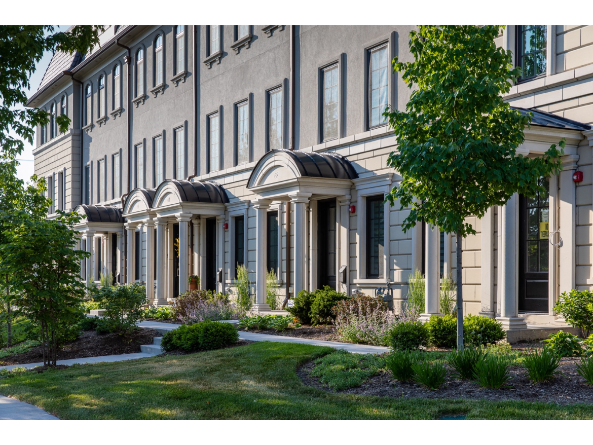
In choosing materials for the project, the Charleston team considered several factors, including aesthetics, cost, durability and, most of all, quality. The exterior aesthetic would contrast stucco with a masonry product that strongly resembles real stone.
Erik Van Someren, President of Multi-Family and Development for Charleston B & D, recalled, “I have to credit our mason, Lukasz Kaplinski, owner of Wheaton-based Polbro Masonry Inc., for advocating for Franklin Stone. We like to consult with our trusted subcontractors to get recommendations in their areas of expertise. He often suggests superior products to us, and this one of them. We’re so proud of the results.”
Franklin Stone is formulated with a mixture of white portland cement and fine aggregates, resulting in a highly dense product with excellent color consistency. The durable concrete masonry units (CMUs) are mold and mildew-resistant and offer an ideal low maintenance alternative to traditional limestone. The aggregates are minimized, giving the stone its smooth natural stone-look finish.
Kaplinski commented, “We had used masonry products in the past on various commercial and residential projects. The stone was cost-effective and easy to install, especially compared to limestone. It went up nicely and turned out beautifully.”
As for the exterior design concept, the stone veneer aided Derrick in achieving two key goals:
“First of all, we wanted to tie the building together as one cohesive unit, not as six separate units,” he noted. “Historically, that was how these buildings were designed, and that’s the look we were going for. The stone was a great product to help create that effect.
“Another consideration was that one end of the building was visible from a well-traveled intersection of the city. Whenever you have a corner—residential or commercial—that side view must be addressed. So instead of the building just wrapping around the sides, both end units protrude out a bit for emphasis, so they became more monumental—they essentially function as bookends.”
On those visible end units, Derrick also scaled up the stone to the second story façades, adding ornate stone sills, coping stones, and headers. Viewed from the front, the decorative tower-like structures bracket the interior units, creating an elegant symmetry, while the prominent corners provide striking side views, particularly noticeable from the busy Aurora/Webster intersection.
The architect added, “The Charleston developers gave me a lot of leeway in design, so that I could include so many great details on the building, which really establishes the look as you’re coming into the west side of Naperville. I was really pleased with the detailing of the stone product—it turned out so crisp.”
Kaplinski concurred, “We are proud that Charleston Row is one of the most recognizable and beautiful buildings in Naperville. It fits nicely into the existing architecture of the city and adds to its charm.”
While the exterior of Charleston Row was designed to project a cohesive look, each unit’s inside space was highly customized. Regardless of the scale of a project, the Charleston in-house design team has gained a reputation for approaching each interior as a blank palette while striving to incorporate the client’s distinct vision into the final outcome.
The firm’s lead designer, Nicole Weiland commented, “The great thing about the design of the exterior of the rowhomes is that it’s timeless, which allowed us to run with any design style inside. Only one would be called traditional with inspiration stemming from the homeowners’ love of older Boston rowhomes. The other five are transitional to modern and incorporate details like floating stairs with glass handrails and extremely contemporary lighting & millwork.”
The six initial Charleston Row units sold out before construction was completed, which led to plans for Charleston Row II, which also sold out quickly. Erik Van Somersen and his team are now working on plans for a third phase, which will keep this collaborative team busy for a long time. The regal structures will stand as a benchmark for quality development over the next several years.
Looking for a reprint of this article?
From high-res PDFs to custom plaques, order your copy today!


